Learn about composition in photography
In this article, I discuss the theme of composition in photography.
According to the Dutch dictionary Van Dale, the definition of composition is "the arrangement of the different parts into a whole".
This definition can be divided into two parts:
1. the ordering and
2. the different parts.
Using guidelines for your composition
Much has been written about 1 (the ordering). Just look on the internet for "spiral composition", "the golden section," or "the rule of third parties". If you look through the viewfinder of your (SLR) camera, you will see several guidelines to follow these composition rules.
Using these composition rules and guides, you can position your main subject in the frame. For the viewer, it is (unconsciously) nice to be guided to the main subject and not get lost in the picture or distracted by other image elements. Here, input lines help.
Furthermore, the isolation of the subject from the environment it is in, helps. It can be done by using the depth of field or by moving closer to the subject so that the environment no longer participates. I wrote about the depth of field in a previous article, which I would like to refer you to.
Now we come to the second part of the definition "the different parts".
As told before, by using the depth of field, you can isolate the subject from its surroundings so that it becomes clear what you as a photographer, want to draw attention to. Reducing the number of parts in the photo will also help the photographer to create his image.
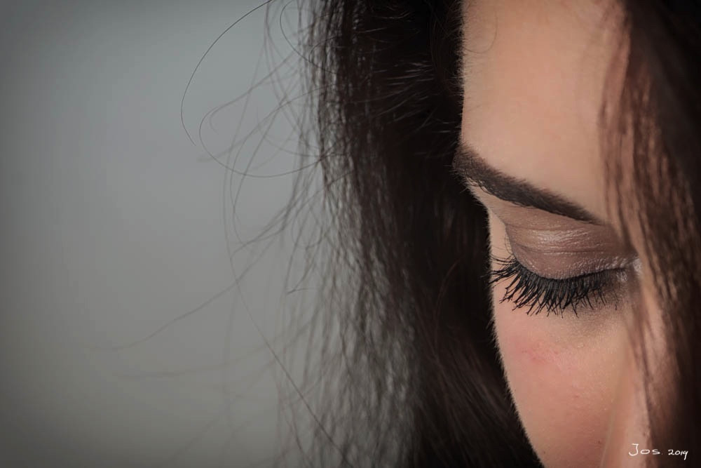
In the picture below, you have no idea or clue in which environment or space the model is. The choice of the aperture also means that the depth of field is so small that it immediately becomes clear that the photographer wants to have a clear view of the closed eye.
Below are three pictures with which I want to clarify how image elements influence them and what you can do about them as a photographer.
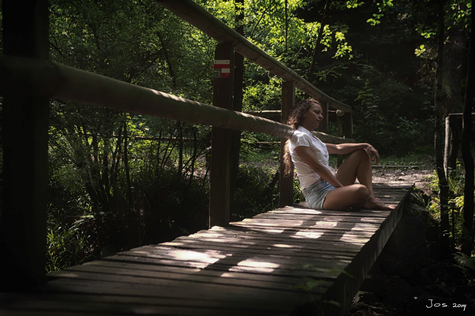
In this picture, you can see that the model in this model photoshoot is neatly positioned on 2/3 of the image. There is also a nice input line, the footbridge. Annoying is the route reference on one of the poles. Partly because of the color, this distracts from the subject. Once you have noticed it, you keep looking at it. Brush away with a photo editing program. What you can also do is take a different position so that this image element disappears.
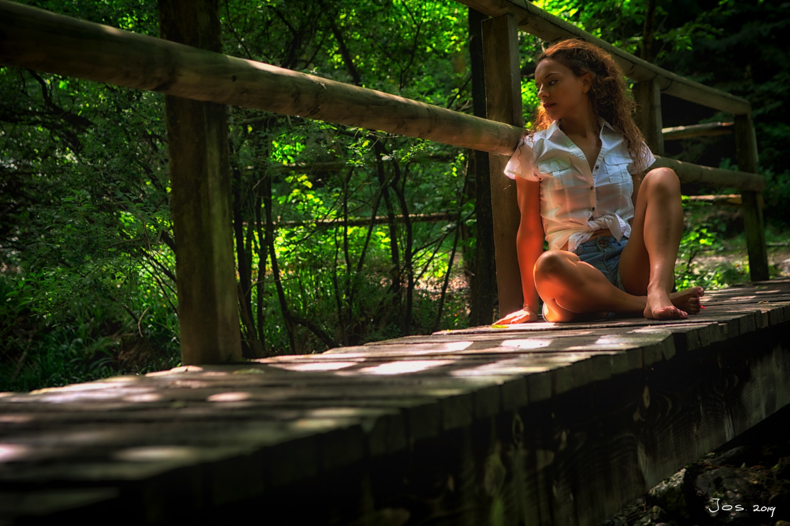
By taking a slightly different point of view, the disturbing image element has disappeared. The attention can now go to the subject as a whole.
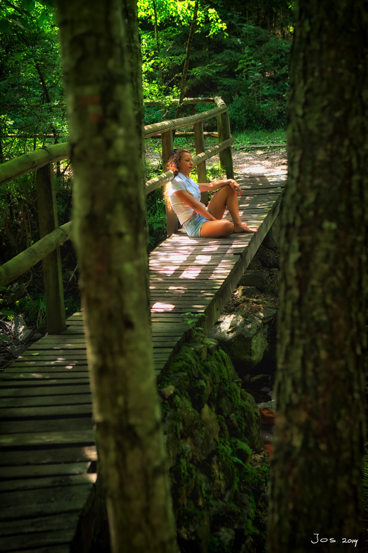
The same situation but a different solution. In this picture, I used a tree in the foreground to mask the disturbing image element on the one hand and to isolate the subject even more from its surroundings, on the other hand. The input line has been maintained, and the subject is still at 2/3.
The input line doesn't necessarily have to start at the bottom left.
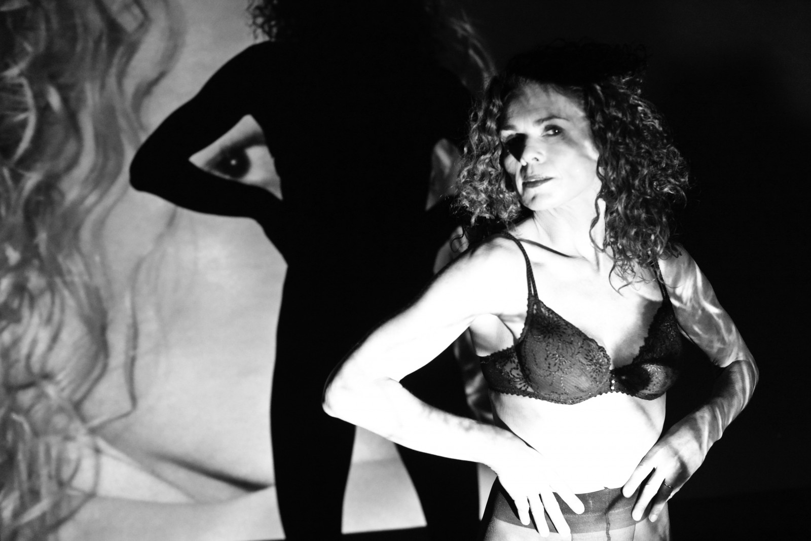
This picture was taken in one go, so no image elements were added here at a later time. The image consists of three layers. From left to right: the projected image, then the shadow of the model, and finally the model. All three images are sharp. So there is no isolation based on the depth of field but by composition.
There is no input line from the bottom left of the image. The diagonal line starting at the top left is used. The three image elements can be sufficiently separated from each other so that the image remains calm for the viewer. The viewer follows the diagonal and finally goes back up again, where he ends up with the eye from the projected image.
Finally, the proof that deviating from a rule also has its charm.
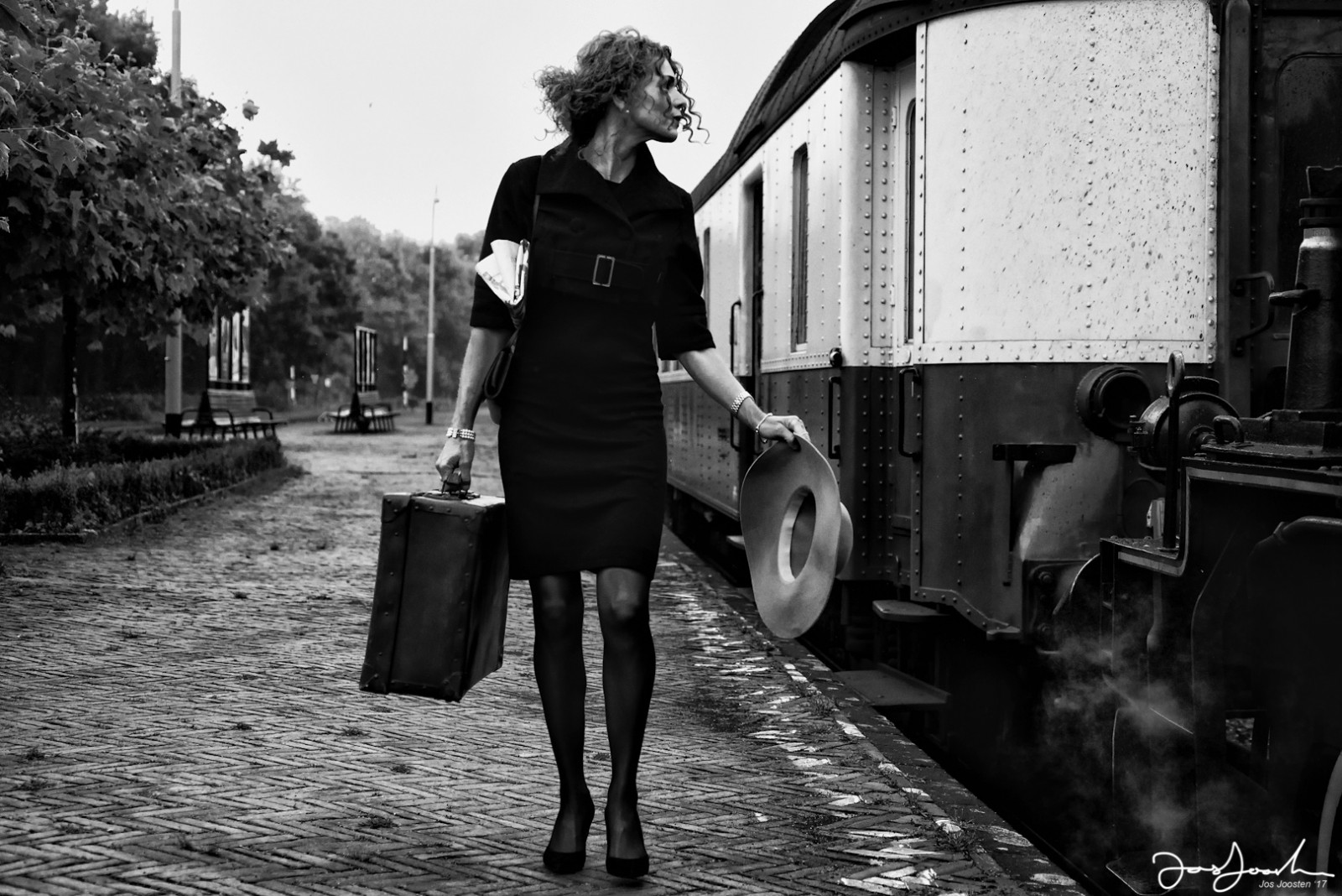
With this picture, there is no input line, no positioning at 1/3 or 2/3 of the image — the central placement of the subject with a lot of depth of field. Because there are no disturbing elements that would (permanently) divert the attention away from the subject, the image is still experienced as "quiet".
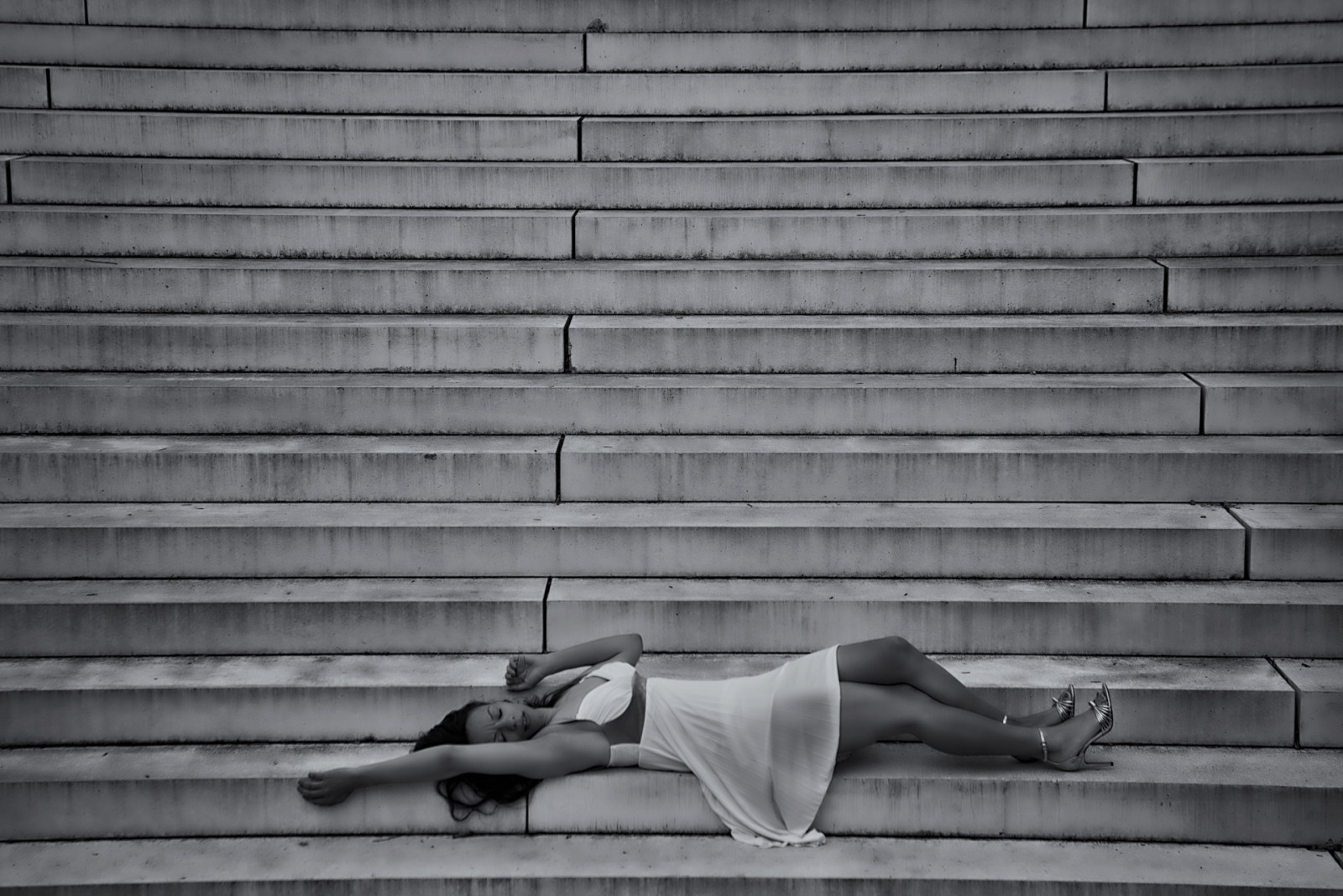
Finally, a picture where the rules, as mentioned above, are abandoned. The model lies as it were on the edge of the image. Furthermore, there is only a monotonous play of lines of the stairs to be seen. When looking at the picture, you will automatically return to the subject, the model.
I made all the pictures in this article. Of course, this (and the text) are copyrighted. I enjoyed writing this article. After all, sharing knowledge is multiplying knowledge. Take advantage of it, but above all, have fun in photography.
Jos Joosten, photographer.
-
Robin Grevelle MorrissTeacher & Freelancer€ 0,38 pm
-
Natalie RamosPhotographer/Writer€ 0,05 pm
-
Glenn van den BoschPhotographer writer€ 0,25 pm
-
Michael KlinkhamerPhotography-CoachFree
-
Dylan DuganCreating photographs€ 0,22 pm
-
Erica Modlinphotographer€ 0,07 pm

